top of page
Background
Partnered with Mortati Design & SF Campus of the Jewish Living Center.
Role
UX Researcher
UIUX Designer
Team
Angela Becerra
Rishikesh Nighot
Timeline
6 Months
Tools
Figma
Canvas
CapCut
Notion
Screen Studio
Research Methods
Secondary Research
Interviews
Prototype Testings
AB Testings
Co-Design Workshops


This project engaged various stakeholders. Mortati Design had previously developed an MCES prototype with SF Campus of the Jewish Living. We collaborated with Mortati Design to create the MCES operational interface.
Our process included an in-depth analysis of
- Stakeholder Relationships,
- Station Workflow
- Staff's Working Schedules
- Stakeholder's Mental Models.
Finally through testing and refinement, we arrived at the final version.

A resident at the campus having a MCES session. A staff member engaging with the resent during the session.

We began by comprehending the MCES Machine and the stakeholder ecosystem.
Upon understanding the situation, we've identified key concerns:
Awareness Gap:
We need to raise awareness to support future scalability.
Content Creation
Dependency: Heavy reliance on the lead designer for content updates.
Data Storage Challenge:
Managing data stored on the lead designer's personal computer.
Manual Workflow:
Dependency on the lead designer during sessions.

Based on the identified concerns, we explored three solution directions.
After discussions with the lead designer, we chose to pursue the workflow design direction.


We began by comprehending the MCES Machine and the stakeholder ecosystem.


We identified 9 operational phases, starting with scene setup. Then we synthesized the touch points experienced by different stakeholders at each stage. Additionally, we identified the necessity for different operating modes for the design.
%201.png)

We thoroughly analyzed the data and used it to create the system architecture and user need hierarchy for our design.


We engaged in a sequence of rapid prototyping and testing sessions, iterating weekly based on the feedback we collected to prepare for our next phase.

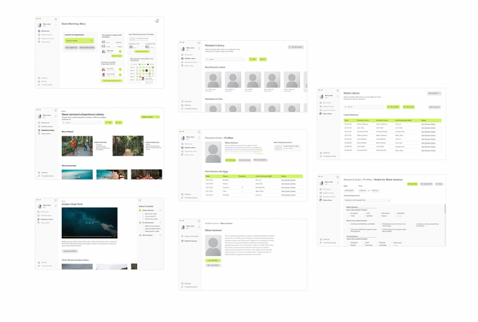
Using the feedback gathered from testing and co-creation sessions, we advanced to higher-fidelity interfaces.


During the final round of user testing sessions with campus staff, we received overall positive feedback on our mid-fidelity prototypes. While some minor adjustments are needed here and there, the response was encouraging.
“Intuitive. Fabulous.”
"It’s really cool that I can navigate this for my first time."
“Nice to compare and see resident progression.”
Quotes From The Testings


MAJOR INSIGHTS
1. UI is clean but the bright green color is too glaring.
2. Section names need to be more intuitive to avoid user confusion.
3. Staff frequently use Notes to track resident progression and inform family members.
We refined our design based on the feedback from the final testing session. However, the "tracking resident progression" function remains a design challenge that we'll address in future development.
NEXT PROJECTS
Customized assessment process that measures service satisfaction.
A digital platform for purchasing organic food products online.
A web redesign project of Giant's Momentum product series.
bottom of page


